Leading UX decisions
Mobile Product Page for Renova Be Verisol Collagen
Company
Role
Team
Timeline
Resume
Problem
A high traffic product page with strong conversion but low average order value caused by unclear kit options and misaligned user expectations.
Solution
A clarity focused redesign that restructured content hierarchy to clearly communicate kit value, usage duration, and long term benefits.
Results
+18%
Average order value
+47%
Page Revenue
+1.4%
Conversion Rate
-12%
Bounce Rate
Full Story
Overview
This project focused on optimizing a key product page within Renova Be's e-commerce. Renova Be is a beauty and wellness company with annual revenue of around 220 million BRL. The page was one of the three most visited on the site — more than 25 thousand monthly visits — and generated over 45% of the company's total revenue.
The product was Verisol Collagen in fruity flavors, the brand's main commercial asset. Because the page concentrated a high volume of traffic and conversions, any change needed to be treated as a decision with high risk and high business impact.
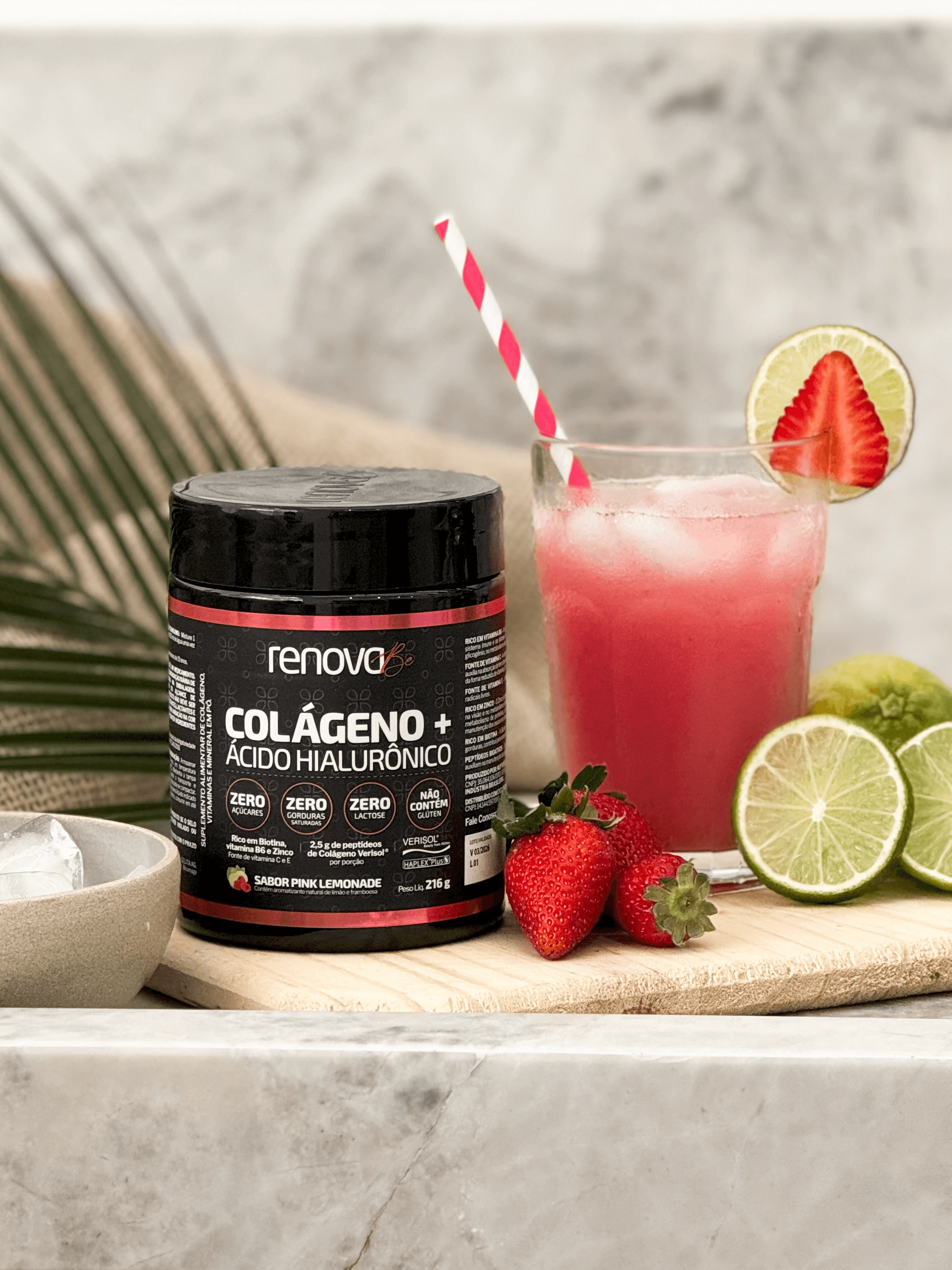
Renova Be Verisol Collagen pink lemonade
Problem
The goal was not to increase conversion at any cost. The page already performed well, but it was inefficient from a business perspective. The average order value was lower than its potential: many users chose to buy only one unit, even though the kits offered better value and a better long-term usage experience.
"
From the business side, there were important constraints that could not be changed. The kits included an additional product due to a tax strategy — an item that could not be removed, but was also not the main purchase driver. The solution needed to respect these limitations while still increasing efficiency, average order value, and revenue.
Approach
Data-driven diagnosis
I analyzed conversion rate, average order value, bounce rate, time on page, and click behavior — combined with heatmaps, session recordings, and funnel analysis.
User insights
To reduce internal bias, I conducted a purchase intent survey with existing customers. Results showed users were willing to spend more when they clearly understood the benefit.
Mobile-first design
With 95% of traffic from mobile, all decisions were fully oriented to that context. I redesigned the page hierarchy to make larger kits easier to understand and compare.
Trade-offs & Alignment
Due to time constraints, I skipped A/B testing and aligned with leadership to launch with post-launch monitoring, prioritizing speed and immediate business value.

User Behavior Data from the Page

Design System
Solution
"Users don't choose larger kits because they don't clearly understand what they're buying, how long it lasts, and why that option makes more sense."
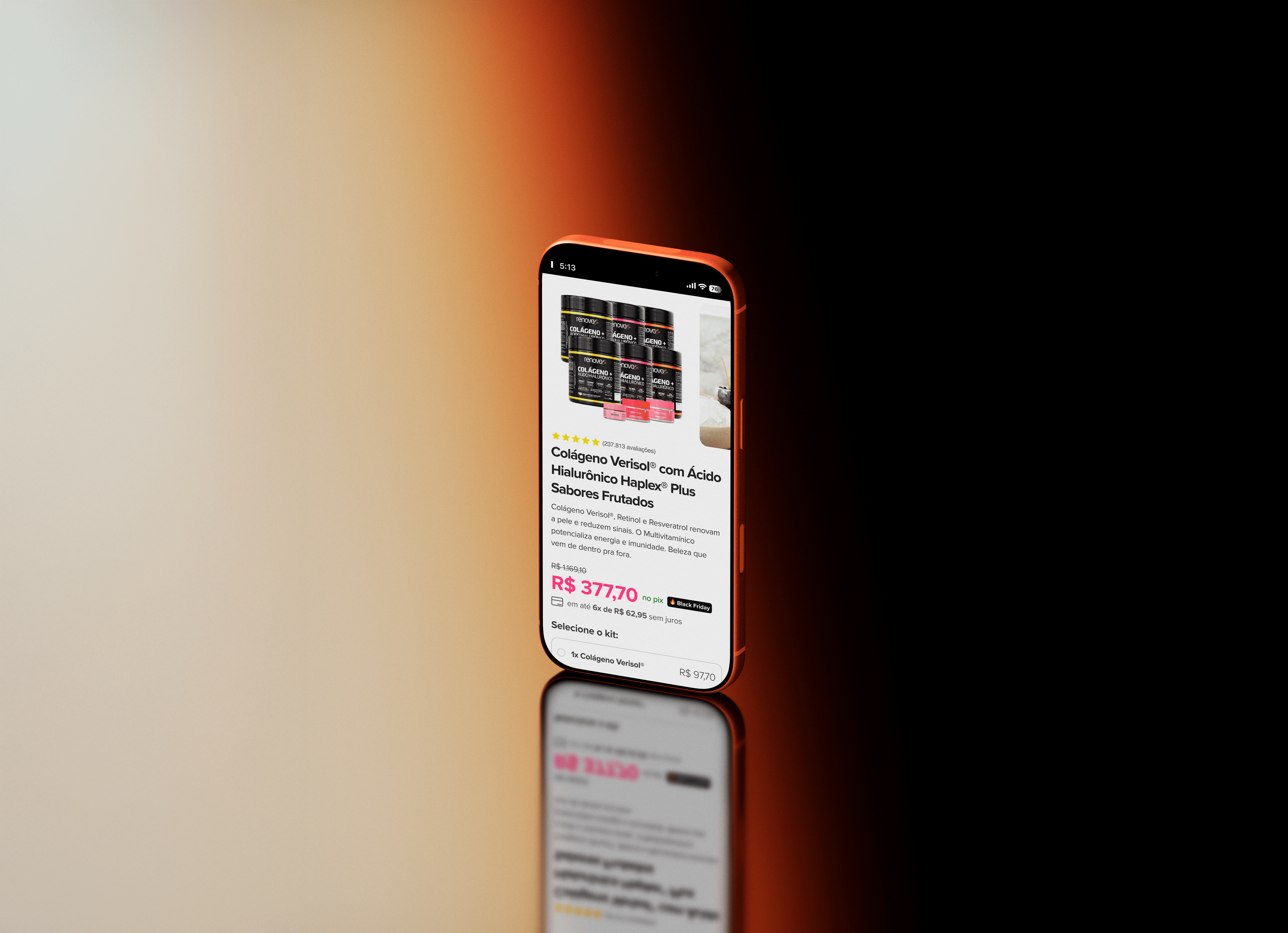
Before
Confusing hierarchy between single units and kits
Product benefits and expected results were unclear
Additional product lacked clear context
User had to figure out the value on their own
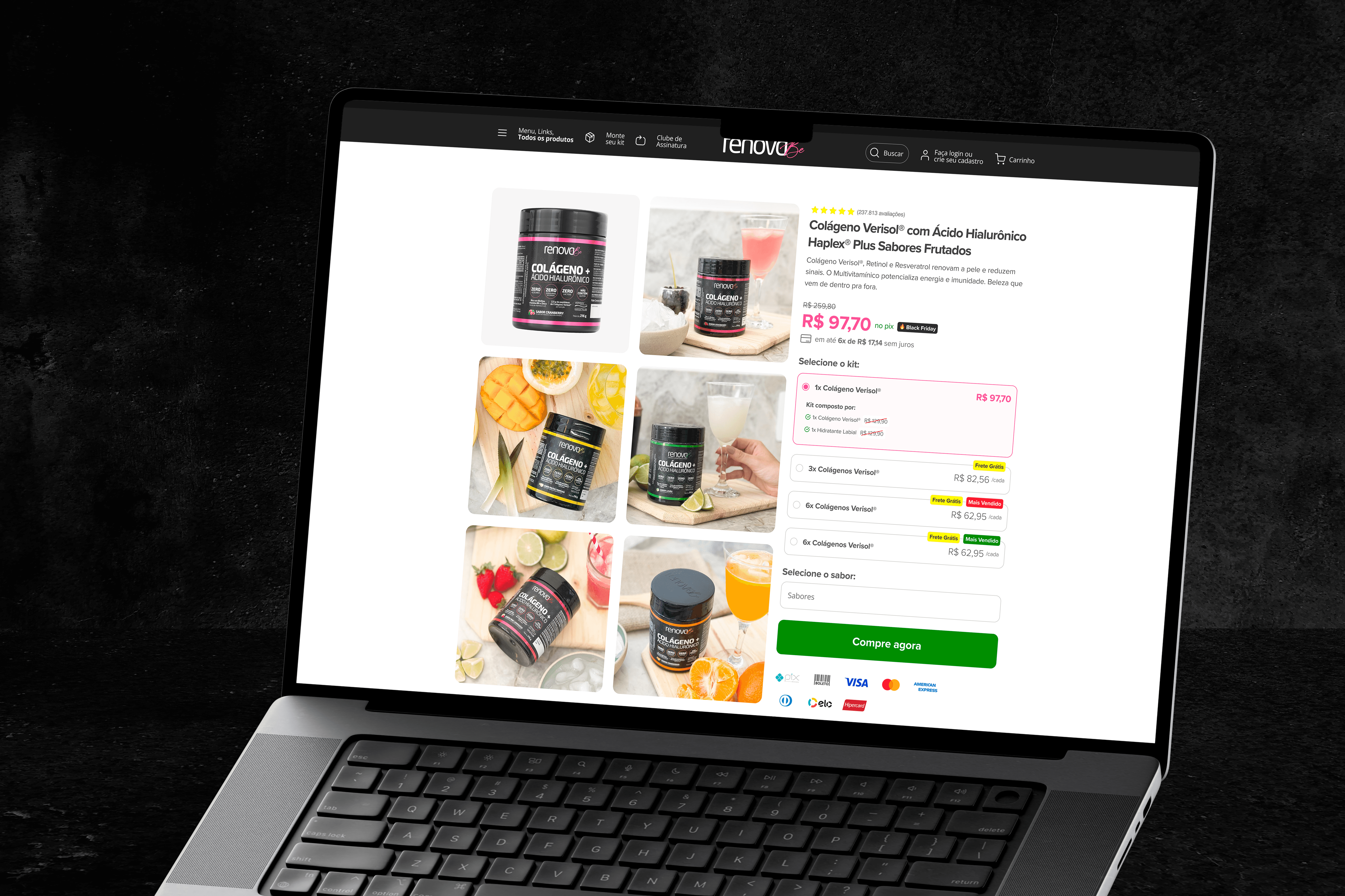
After
Larger kits highlighted and easy to compare
Results, benefits, quantity, and savings clearly communicated
Additional product contextualized honestly
Page guides the decision — without pushing the user
The main strategic decision was to avoid forced persuasion and focus on clarity.
The goal was to reduce cognitive effort and turn a confusing choice into an obvious one.
old


new
Results
The results confirmed the strategy. Average order value increased by 18%, from R$219 to R$259, bounce rate dropped from 43% to 31%, and conversion rate improved from 2.2% to 3.4%, peaking at 4.5% during seasonal periods.
Page revenue increased by 47% within 30 days after launch. Given the importance of this page to the company's revenue, these decisions had a direct and meaningful impact on the annual business results.
+18%
Average order value
+47%
Page Revenue
+1.4%
Conversion Rate
-12%
Bounce Rate
Key Learnings
This project reinforced my role as a designer who leads decisions in environments with real constraints. UX was not treated as a visual layer, but as a strategic tool to solve business problems.
It is not always possible to test everything. Design leadership also means taking calculated risks, communicating trade offs clearly, and being accountable for results.
When UX takes responsibility for financial impact, it stops being a support function and becomes a central part of the company strategy.
Desktop Product Page for Renova Be Verisol Collagen

Desktop Product Page for Renova Be Verisol Collagen
